PostgreSQL and SQL Server monitoring for your entire estate. Optimize performance, ensure security, and mitigate potential risks with fast deep-dive analysis and customizable alerting.
Redgate Monitor helps you manage your entire SQL Server and PostgreSQL estate from a single pane of glass. Proactively mitigate potential risks with instant problem diagnosis and customizable alerting – wherever your databases are hosted. No downtime, customer complaints, or wake-up calls at 3am.
Benefits
Redgate Monitor accelerates your daily database maintenance and frees up time to proactively improve the performance and security of your servers. Built-in tips and guidance ensure you get the most out of the information provided.
Whether your databases are hosted on-premises, in the cloud or a mixture of both, with instant problem diagnosis and customizable alerts you have the answers to the health of your estate at your fingertips. Drill down into potential issues and solve them before they become a problem.
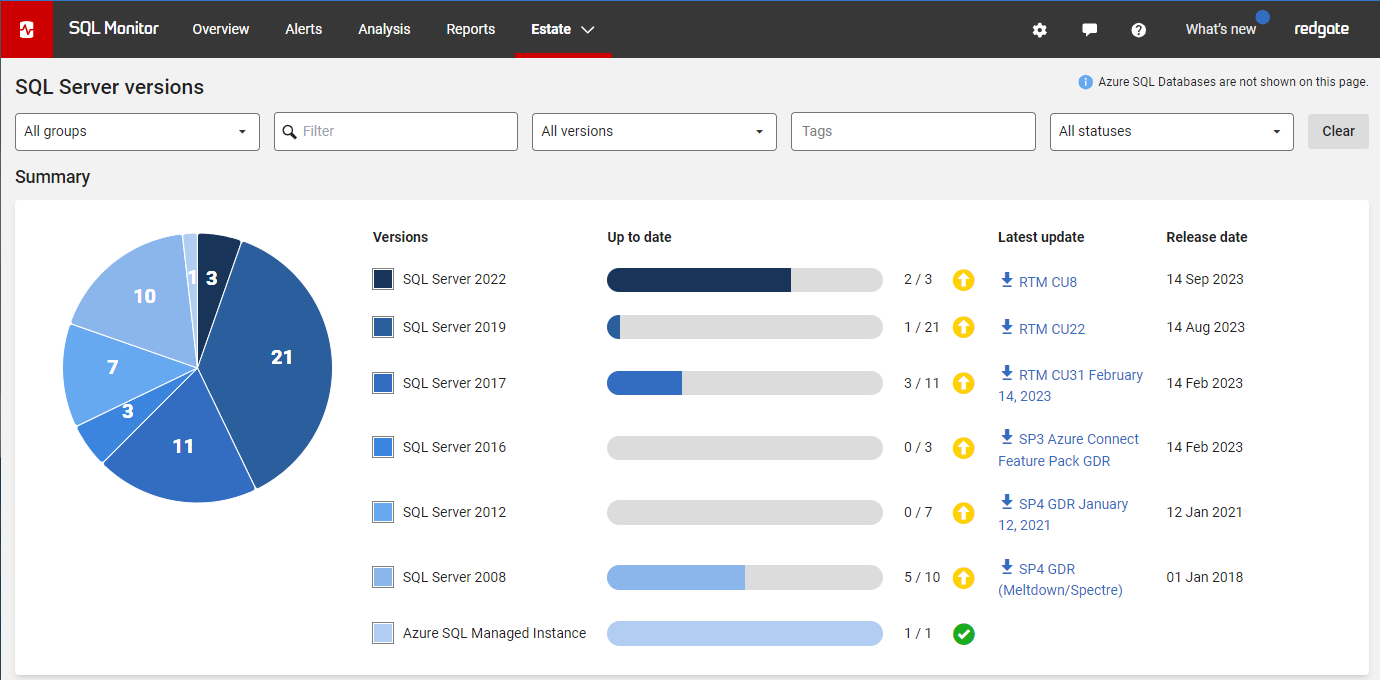
Redgate Monitor grows and adapts with your server estate. Regardless of where your servers are hosted, consistent monitoring for on-prem and cloud databases means you can manage your entire environment from a single pane of glass - allowing you to stay on top of configurations, access rights, installed versions and patches, licensing, disk usage statistics, backups and more.
Learn more about monitoring Azure SQL Database and Amazon RDS.
Try the live environment to see how Redgate Monitor works right away
Try the online demo| Global Overview - See all your servers at a glance | |
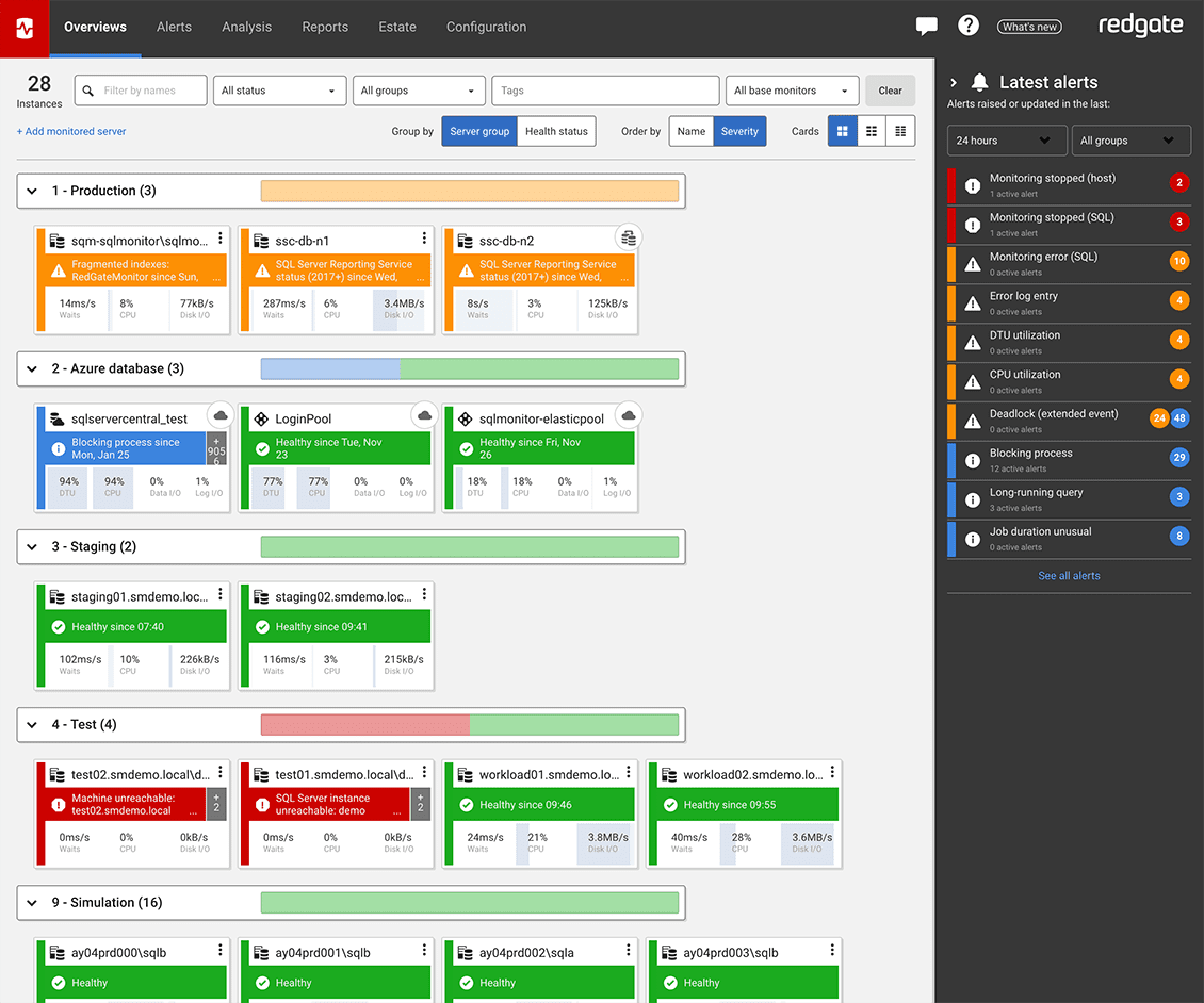
View all your SQL Server and PostgreSQL instances, availability groups, clusters and virtual machines on one central web-based interface, regardless of location or restrictions. If anything needs attention, you can quickly drill down for detailed performance statistics. 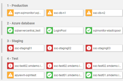 | |
| Hybrid Monitoring - Consistent monitoring for on-prem and cloud databases | |
Context-rich diagnostic insights allow you to understand performance patterns and get to the root cause of cloud database problems quickly. Collect metrics that are specific to your cloud provider while ensuring a consistent monitoring experience across your on-prem and cloud database estate to keep your hybrid environment healthy. 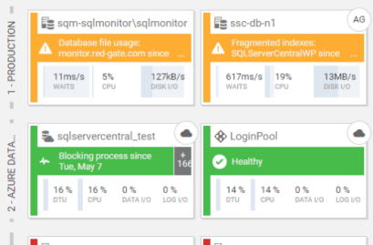 | |
| Diagnosis - Understand and resolve problems in an instant | |
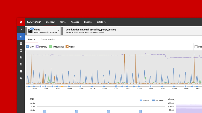
When performance issues occur, time is at a premium. Redgate Monitor gives you more than just raw data. Get context-rich performance metrics to quickly pinpoint the cause of any problems. Use intelligent baselines to find the root cause - not just the symptom - and leverage built-in tips and guidance to resolve issues faster. 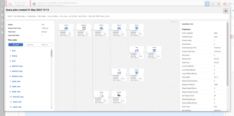 | |
| Alerting - Know about issues first | |
Redgate Monitor comes preconfigured with over 65 fully-customizable alerts for the most important operational and performance issues. You can also build your own metrics and alerts, or download ones created by our community of experts. Alerts are displayed in our Grouped Inbox, arranged by common themes and issues, so they are easy to see, prioritize and act on. You can also set up alert notifications to come through email, Slack, PagerDuty, SNMP traps, or your ticketing tool of choice using webhooks. You can also manage your alerts using PowerShell and our API. 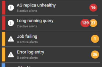 | |
| Deployments - Unearth bad database deployments | |
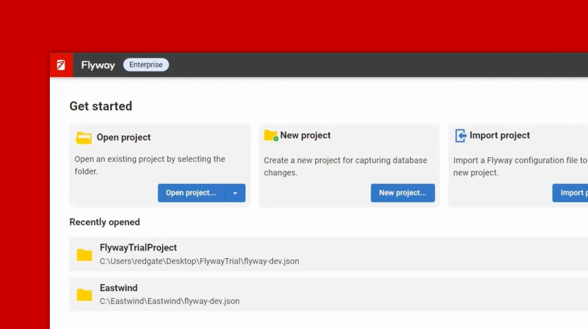
Every time you make a deployment, Redgate Monitor picks up this information and displays it on the Instance timeline alongside key SQL Server and PostgreSQL metrics. If you suddenly experience unusual behavior after a deployment, you’ll know exactly where to start your investigation. If you’re deploying your database changes using Redgate’s deployment tool Flyway, you can see details of that deployment directly within Redgate Monitor. You can also integrate third-party deployment tools using PowerShell and our API to see custom annotations on the overview graphs.  | |
| Query impact - Find and fix problematic queries faster | |
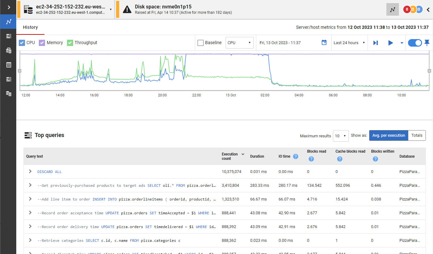
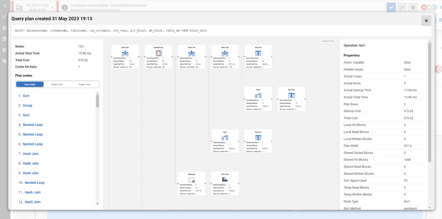
Quickly find and fix deadlocks, long-running and costly queries with insights on performance details, delays caused by resource waits, the T-SQL text, and the query plan. Get recommendations and guidance on how to optimize your queries and track them to compare their performance over time. With query history, you can easily reveal patterns and trends that influence performance. 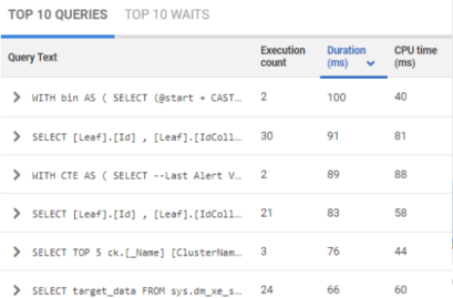 | |
| Security auditing - Ensure data security and regulatory compliance | |
Minimize manual efforts in ensuring data security and configuration compliance with instant visibility into access rights, streamlined compliance checks, and automated server configuration audits against gold standards. 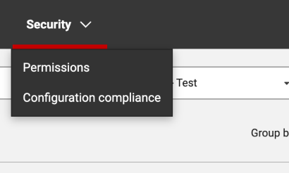 | |
| Reporting - Keep your stakeholders in the loop | |
Ease stakeholder reporting, ensuring key insights are conveyed without delving into sensitive or overly granular details. Opt for automated PDF reports with essential metrics like server uptime, alert statistics and disk usage trends - or create custom reports via our REST API, focusing on critical information tailored to your organization’s unique needs. 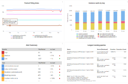 | |
“I wanted to be more proactive by helping developers gain control over what went wrong, when it went wrong, and to be able to show them how they could fix it.”
With Redgate Monitor, Digital Outsource Services is able to catch deployment issues before they impact the business - saving 15 hours a week in manual checking.
“Monitor lets us quickly know what the exact problem is, so we can jump on it and fix it before the customer even notices.”
“The alerting is really helpful, being able to filter out the noise and get exactly what we need.”
TruStone Financial uses Redgate Monitor to assess which databases to migrate to the cloud and control cloud database spend.
You will require one license per server, regardless of how many instances are on that server.
One Redgate Monitor license allows you to monitor up to 5 Azure SQL Databases.
You can monitor 1 x server instance hosted on either Microsoft Azure Managed Instances or Amazon RDS with one Redgate Monitor license
Redgate Monitor supports monitoring Windows failover clusters. You will need one license for each node in a monitored cluster. Other proprietary clustering server systems aren't supported, and might not behave as expected.
You can monitor database instances running on Virtual Machines (VMs). One Redgate Monitor license is required per VM being monitored.
0800 169 7433
sales@red-gate.com
$1,098 per server, per year
Ideal for businesses looking for a powerful, comprehensive database monitoring solution.
Contact us
The perfect choice for large organizations requiring advanced monitoring capabilities.
Jump right in! Best for those who like to dig around and see how a tool works right away.
Prefer someone to walk you through all the latest features and offer you some tips along the way? Watch this 30-minute demo at your own pace.
If you want a little longer to play around with Redgate Monitor, the good news is it's yours, for free, for 14 days.
| SQL Server | PostgreSQL | |
|---|---|---|
| Windows (including cloud vms) | ||
| Linux (including cloud vms) | ||
| Amazon RDS | ||
| Amazon Aurora | n/a | |
| Azure SQL DB | On roadmap | |
| Azure Managed Instance | n/a |
Whether you’re an experienced database professional, just starting your career, or need to take care of databases on the side, Redgate Monitor gets you up and running quickly without sacrificing the depth of the diagnostic insights you need.
Redgate Monitor is built to scale with the ever-increasing growth in server estates and the complexity of how data is hosted. Once you start using Redgate Monitor, it will grow with your data and your needs.
Instead of just tracking issues, Redgate Monitor allows you to spot potential problems early, while you have time to plan the best response - rather than firefighting alerts as they occur.
Integration with deployment tools such as Flyway, and the ability to provide developers with access to diagnostic data, helps to display the impact of deployments (e.g. on CPU) and improves collaboration between developers and DBAs.
We’ve specialized in database software for over 20 years and dedicate four in-house development teams to continuously improve Redgate Monitor.
With various information, training resources and a large community of database professionals, we’re there to empower you to get the most out of monitoring your servers.
Whether you want more details about Redgate Monitor, a demo, or to know about best practice – get in touch.

Redgate has specialized in database software for 20 years. Our products are used by 804,000 IT professionals, in more than 100,000 companies.

Redgate offers comprehensive documentation and a friendly, helpful support team. An average 87% of customers rate our support 'Excellent'.